Just as you FINALLY get use to your new Windows 7 computer, or become more secure in the fact that you don’t HAVE to upgrade from Windows XP which is “working just fine, thank you!” … Microsoft does its “usual” thing and releases more details on Windows 8 and the “Metro UI” that will once again change our computer desktop, and leave us fumbling around in the dark.
[Ok… cheap plug… I’m just putting the finishing touches on a new book called “The Windows PC Guidebook” that you can pre-purchase at 20% OFF until next Wednesday, March 14th at 11:00 PM. CLICK HERE for more details…]
To be honest, it’s not going to be THAT bad. Your old programs will still work and look as they always have, which is a good thing.
It’s the Windows Desktop that’s changing… and for a lot of folks, that’s where the “trouble” will lie.

Now, before you go off screaming into the night, the truth is the Live Tiles look to be pretty cool. They are basically, big, colorful rectangles where you can group together programs, and even see live content (such as a calendar, email messages, etc.) on the fly.

Finally, the currently running apps menu appears when you move your mouse to the lower left corner of the screen, and from it you can click and jump to any open program or window.
All this is fine and dandy, and perhaps with time, I can force myself to get use to the new Desktop.
But there is something I’ve read about that REALLY BUGS me about Windows 8. The RIGHT CLICK context sensitive MENU that I’ve come to know, use, and love is fading away! Yes, it will still be somewhat available inside of programs like Word or Internet Explorer (for now), but on the Windows Desktop and in many places, clicking the right mouse button will display a bar at the bottom of the screen with who-knows-what on it.
That, I’m not too happy about!
But again, maybe with time, I’ll get use to it.
So now it’s time to ask the million-dollar question… Why on earth is Microsoft making these changes with Windows 8?
The answer is really pretty simple. Can you say… “touch-screens, tablets, smartphones, and mobile touch-devices”?
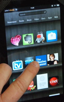
Let’s face it, touch-screen computing is becoming all the rage, and with good reason. A lot of folks who have touch devices such as an iPad, iPhone, or Amazon Kindle, love them.
Think about it for a moment… when you first started using the mouse on your PC, did if feel comfortable? Does it feel comfortable now? You’d be surprised at how many of our students still struggle with using the mouse, and with good reason. The mouse never will be an intuitive way to interact with your computer. There’s just nothing else we “do in life” that is quite like using a mouse.
 Pointing and touching with your fingers, on the other hand, is something we do all the time. And many of our students who have used touch devices find themselves dreading going back to the mouse on their PCs.
And that’s why at some point in the near future, desktop touch screens will become the standard, and that’s what Microsoft is banking on with Windows 8.
The Windows XP and Windows 7 Desktop is just not conducive to “touching”. It was completely designed with the mouse in mind.
The Windows 8 Metro UI Desktop, on the other hand, is completely geared toward touch-screens. And that’s why we’re seeing this big change.
But now to the second million-dollar question… do I have to, or should I upgrade to Windows 8?
Nope.
In class and in other articles, a lot of you have heard me say that Windows 7 is the best version of Windows that Microsoft has ever produced, and I stand by that statement.
And before Windows 7 came out, Windows XP held that title with me.
I see no reason why anyone should necessarily have to run out and upgrade to Windows 8 when it’s released late this year, or early in 2013. This is especially true since Microsoft recently said they would continue “mainstream support” of Windows 7 through 2015 and “extended support” through 2020.
And even with Windows XP, the extended support lasts through 2014.
[You can see the Support Lifecycle for any Microsoft product by going to support.microsoft.com/gp/lifeselectindex]
Of course the one exception to this is if you DO decide to purchase a desktop touch-screen, or need to run Windows on a mobile device. Then I think that Windows 8 would be worth the upgrade, and probably work a lot better than Windows 7.
So there you have it…. my early thoughts on Windows 8.
As the year progresses, I’m sure we’ll hear more and more about Windows 8 happenings, but for now, I’ll just continue to learn and then teach what I can about Windows 7.
By the way, if you would like to read more about Windows 8, here are some good articles you can check out:
- PCWorld – Windows 8 Metro UI: A bold new face for Windows
- ZDNet – Windows 8 Consumer Preview: a fresh start
- CNet – How to Customize your Windows 8 Desktop
And again, you can get a great deal on my new Windows PC Guidebook by pre-0rdering it before Wednesday, March 14th at 11:00 PM. CLICK HERE for more information about the book.
As always, I’d love to hear your experiences or comments. You can leave them below…


Hi John,
We sure are enjoying your newsletter and have ordered your new book — to these two old “seniors” I know it will be very helpfull. Sure wish we had just one little part of your technology and skill!
Dee & Jon Schuetz
Hi Dee and Jon
Great to hear from you AND thanks so much for picking up the new book. I sure hope you find it useful.
Trust me in that I’m going to be a lot more active, writing articles and putting together other materials, including webinars and videos, for all my friends in the Omaha area… and beyond!
You guys take care!!!!
John;Some one like me that always worrys about change, this dose not
worry me at all, just wait and see how it affects you, as i am one that dose
not use to many of the new gagets, i will wait and see. We should all be
just fine. And thanks for all of the up dates. Harold
Hi Harold!
Yup… totally agree. Waiting and seeing with new Windows versions is ALWAYS the best thing to do… especially since being on the “bleeding” edge with Microsoft has gotten folks in trouble in the past. And since Windows 7 really IS a good version… Microsoft is really going to have to do some convincing to get a lot of people to change.
Take care!!!!
John Lortz
For one who prefers a “clean desktop,” and things well organized under the desktop, this does not bode well. I hope Microsoft will be so kind to us as to make some kind of directory tree available. And sorry, I can’t see how a “touch screen” will ever be able to deliver the real precision necessary for desktop publishing and graphic art programs.